|
Search engine offline
|
The Big E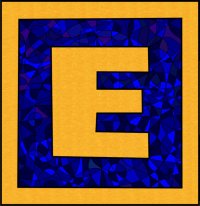
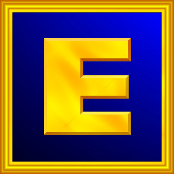
When the Association For Meridian Therapies became The Guild of Energists, it needed a new logo. This is the story of the Big E ...
Added Oct 29, 2016
|
| 6,619 Reads
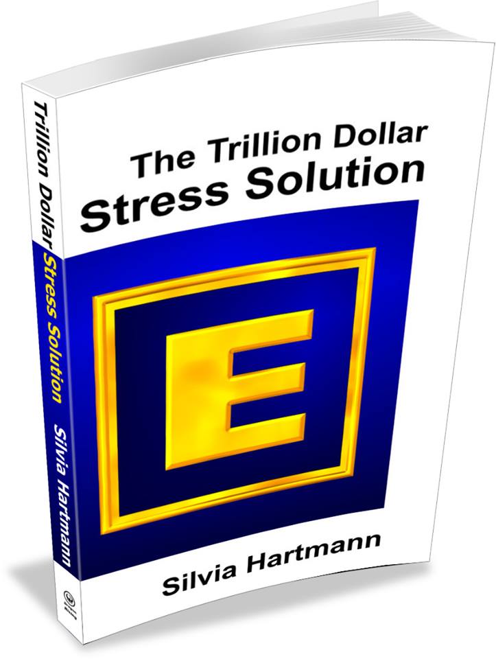
The Big EWhen the Association For Meridian Therapies became The Guild of Energists, it needed a new logo. After much discussion, it was decided to leave it to me what it should be and I went for The Big E in gold and blue. Many people wondered why the Big E is so square and architectural, rather than being all flowey with hearts, swirls and scrolls. My take on it is as follows. Modern Energy needs to break into the world of human consciousness as it stands. We already have the unicorns, herds of them. What we need and what the world needs right now is for reasonable, rational, logical people as well as the hard nosed business people to get it that energy is a huge competitive advantage. Working with 6 senses instead of 5 gives you that quite significant 16.7% advantage over everyone else. And it connects the dots. Read more about this in The Trillion Dollar Stress Solution: Modern Stress Management. In the meantime ... The world of bankers is square. Here's something to remind us of this.
The world of men, which some erroneously perceive as "the real world" (which it really isn't!) and which we call "The Hard" is not a good place to be grazing unicorns. It's square. And energy needs to be injected here to make all our worlds more humane, more sane, more exciting and more predictable and safer too. There is a protection function built in; it is a shield surrounding the main message: ENERGY IS REAL. This is what the GoE is all about. We are not trying to sneak energy in through the back door. We are not here to obfuscate the fact that it is energy work for living energy bodies which we are doing. We are not sugar coating the enormous X-Factor that is ENERGY to make it more palatable to those who are energy reversed, energy blind, energy poor. It's all about ENERGY!
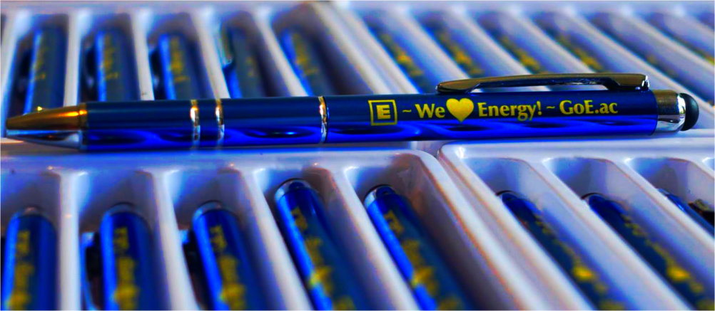
So that's why the Big E is square and has a big E at its centre. The gold and blue - well, we have The Heart of Gold as a representation of the heart of energy, the power generator in the centre of the energy system, and true blue, well that's always a fine thing, a healing thing. "Gold and blue is the morning." There's much healing that still needs to be done, most of all the break between love and logic ... The Big E is a clear cut power symbol that states its intention to act not only in physical and energy reality, but also to stand strong in the Hard. That's important, and that's why it's so square. The Big E was duly adopted and can now be seen on ... Pens
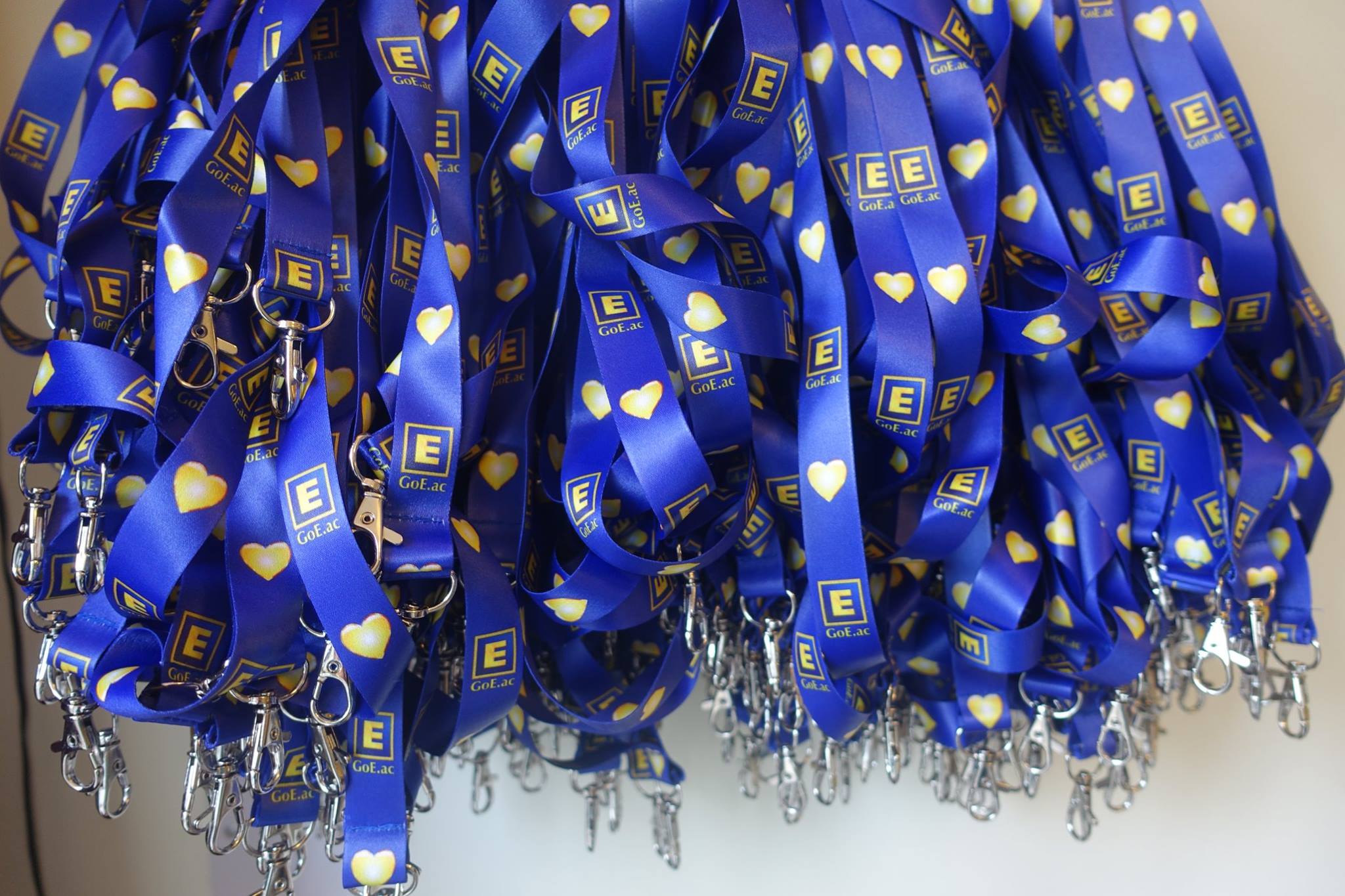
Lanyards ...
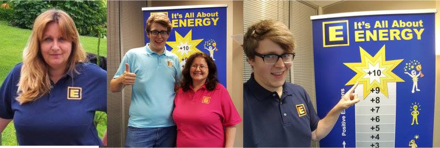
Poloshirts ...
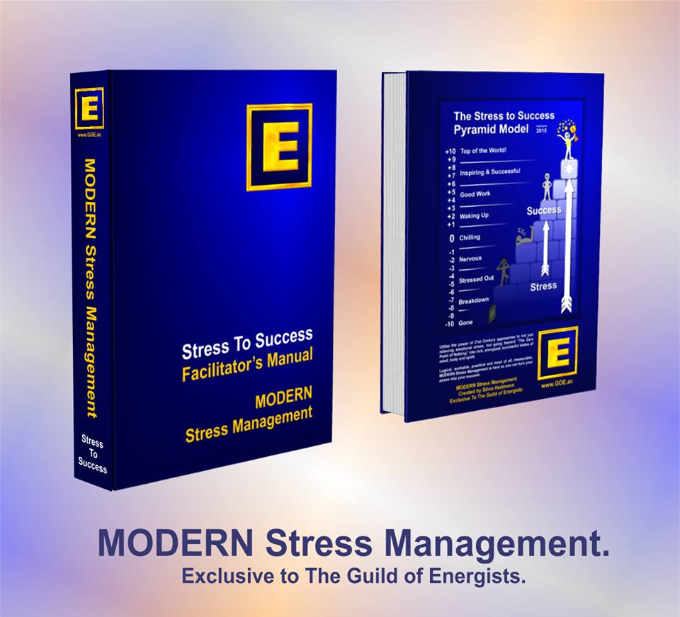
Training Manuals
Books ...
Facebook Memes
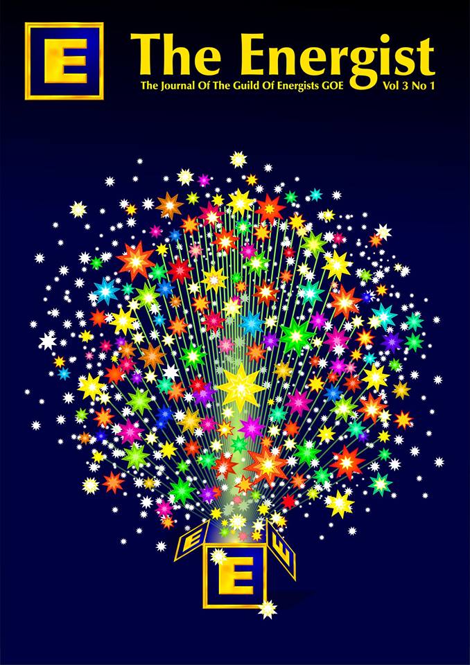
On the cover of the magazine ...
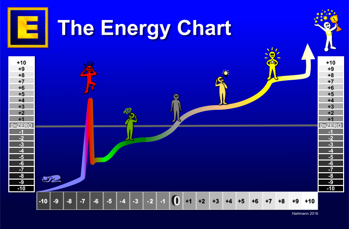
Diagrams ...
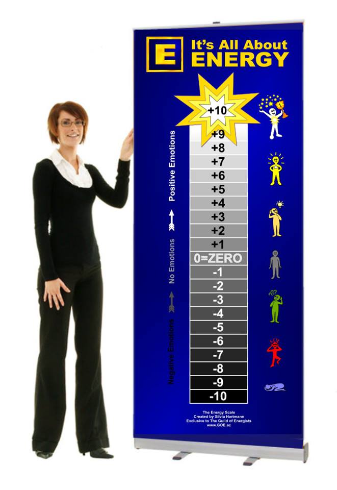
Pull Up Banners ...
Gold plated pin badges ...
Coffee Mugs ...
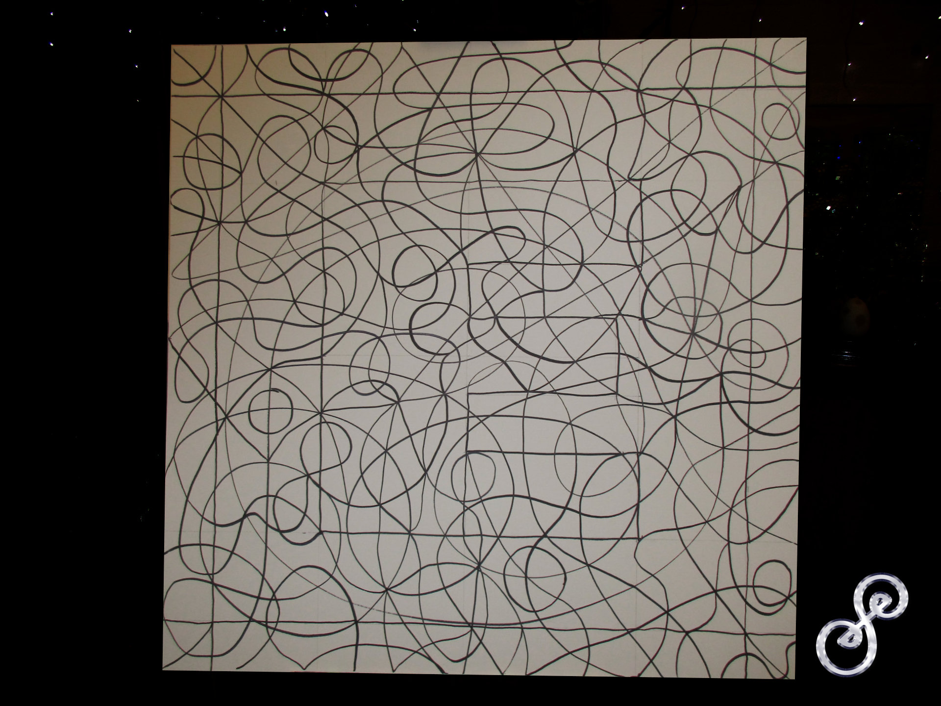
... and of course on brochures, web sites, as a badge of quality services, on letterheads, on business cards - you name it, the Big E is going out there into the real world. Yes, and so at a staff meeting, talk came of ordering a large E for the conference. I was asked to prepare the files for the printer and then decided to do a big Symbol Hybrid painting instead. Seemed a much better thing to do ... :-) Here is the symbol matrix for the Big E.
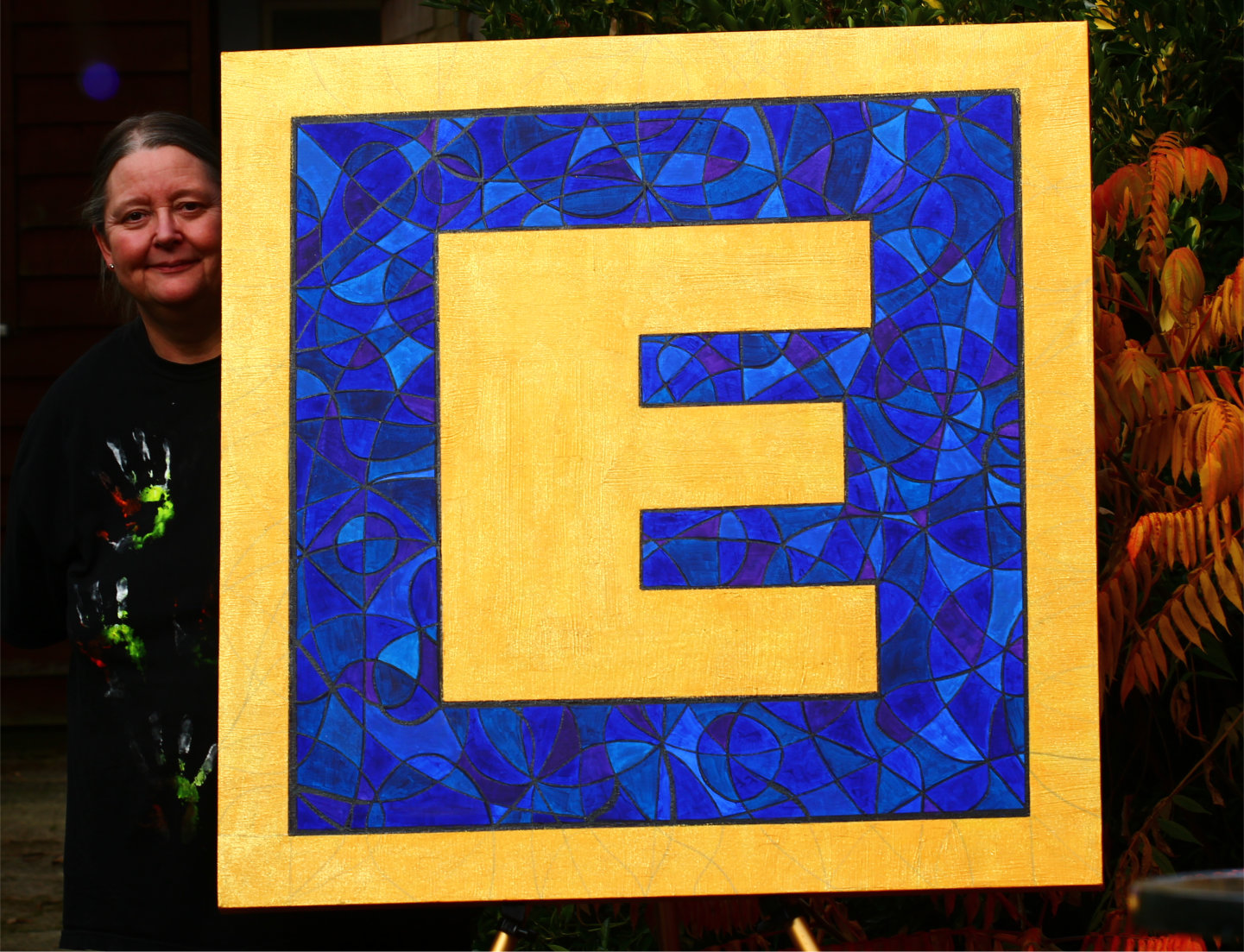
And here it is - The Big E Symbol Painting!
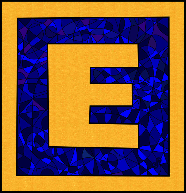
As usual, the colours are much deeper and the gold sparkles :-) And here is the printable, reproduceable vector version.
And that's the story of the Big E ... so far ... :-)
Silvia Hartmann October 2016
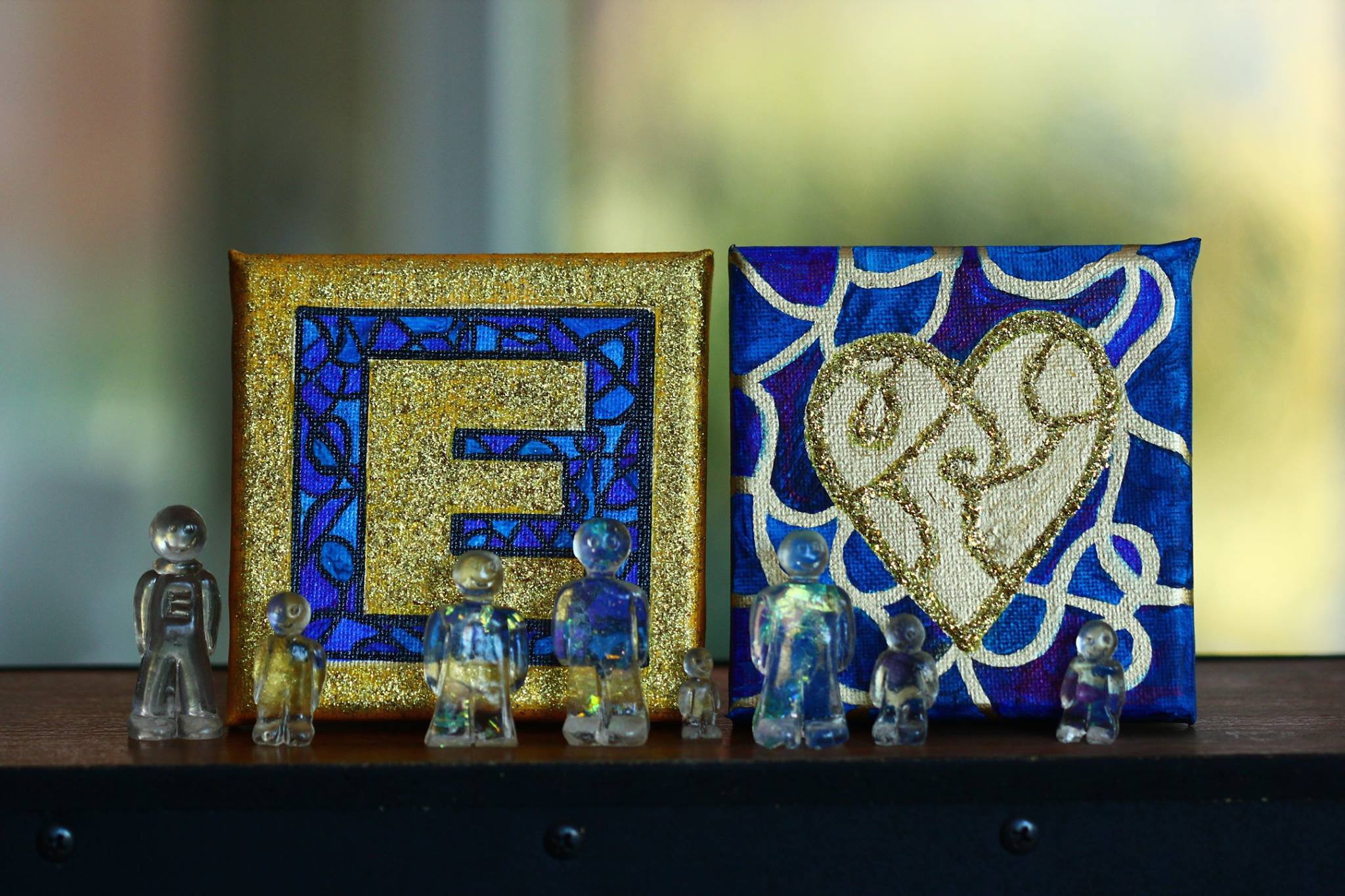
The Big E gained a Little E!
Yes, it's the Little E cupcake! The Mens were obviously ecstatic to have their own versions of the big paintings.
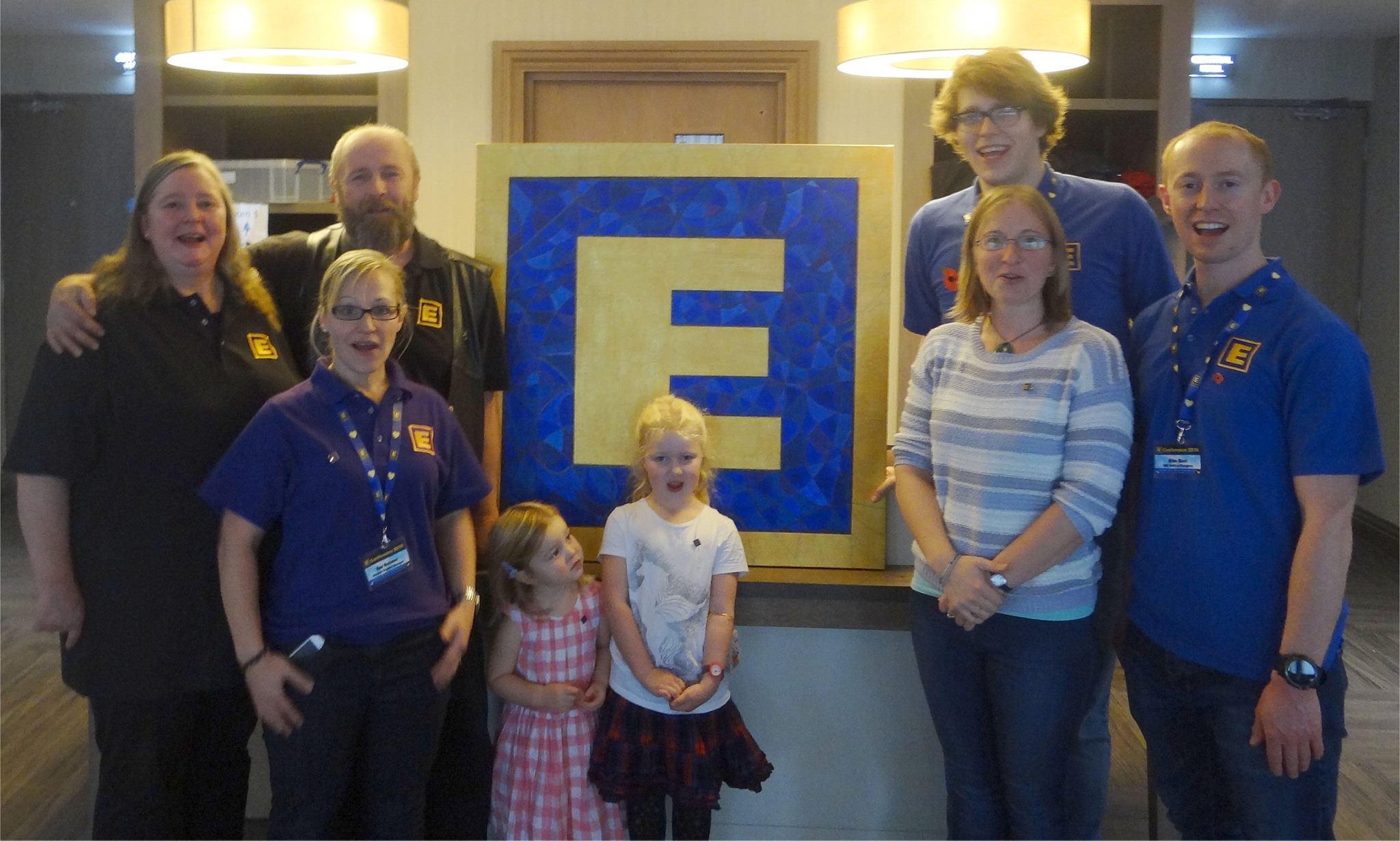
The Big E went to the conference!The First Modern Energy Conference, November 2016, The View, Eastbourne, United Kingdom
With staff & family
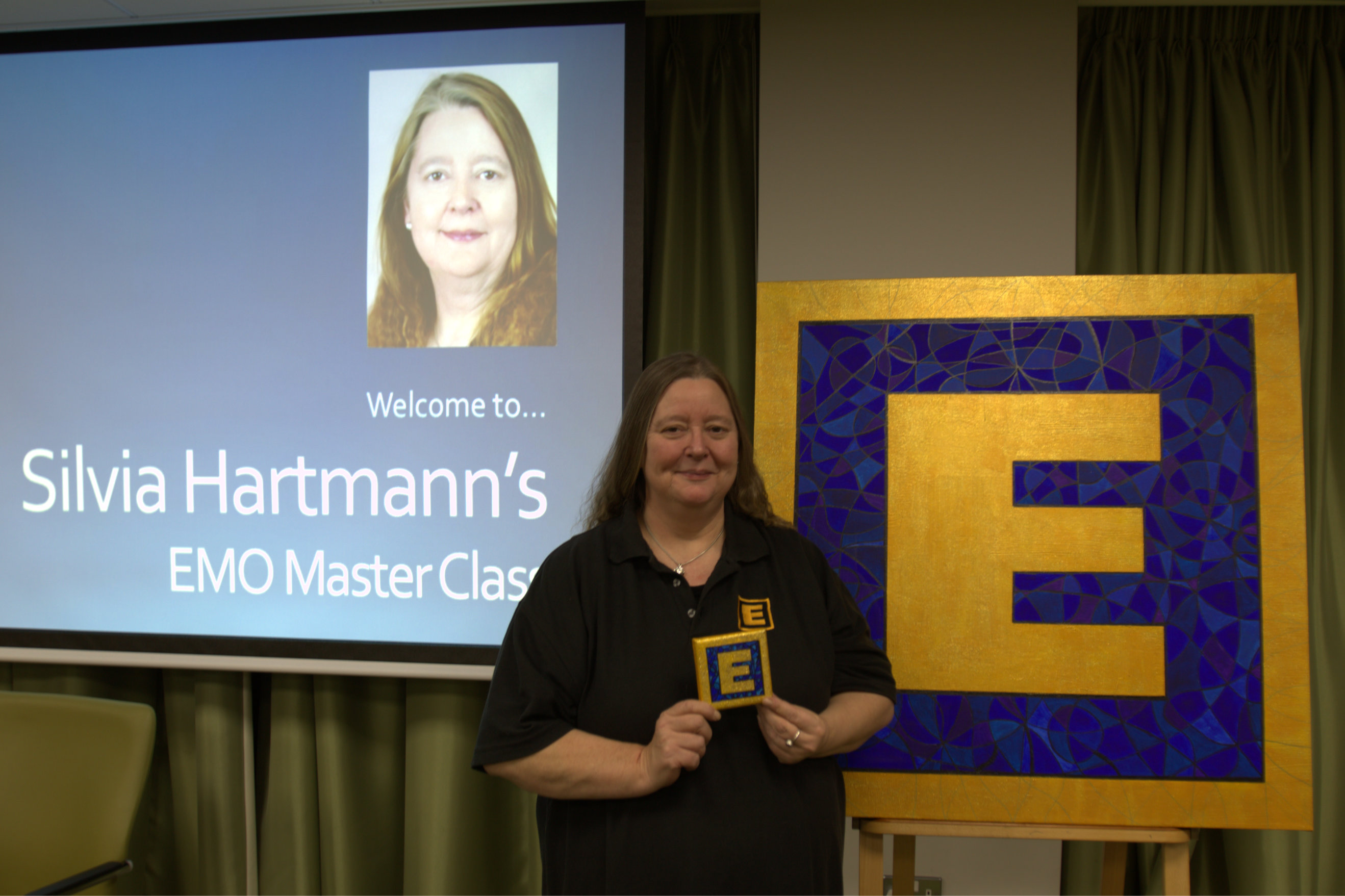
Silvia Hartmann with the Big E and Little E paintings before the EMO Masterclass.
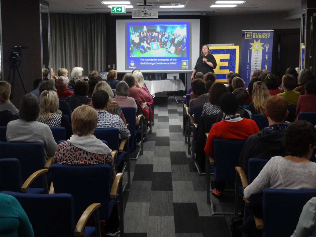
Giving the keynote before the Big E :-)
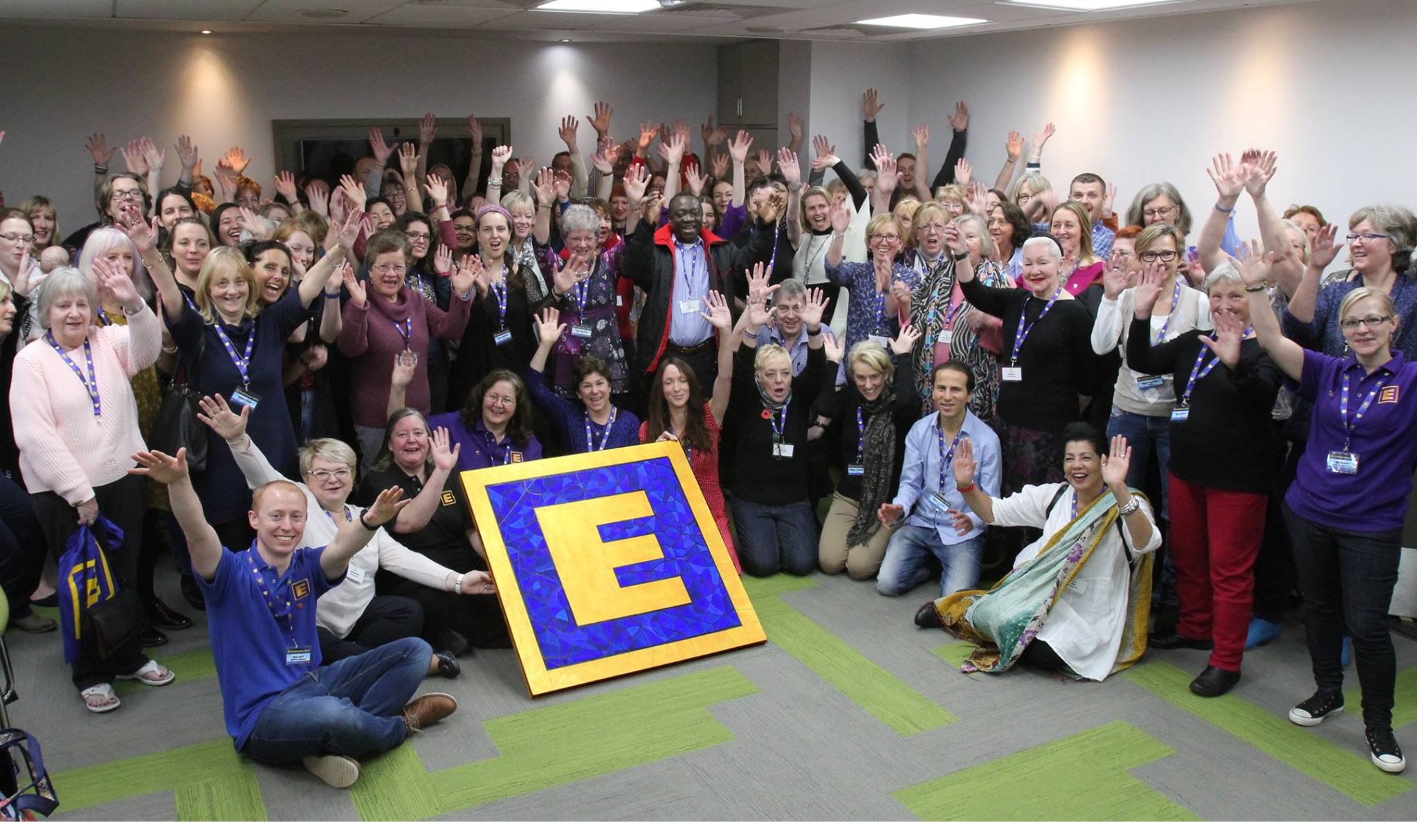
Art at the Centre! :-)
... Quite as it should be!
Added Oct 29, 2016
|
| 6,619 Reads
 |

