Art, Symbols, Fascination
& The Eternal Love Of The Light
Energy Art Retrospective With Silvia Hartmann 1994
III: 23 Years Of Illegal Designs
Q: I want to mention your book illustrations and your other design work. How long have you been working as a graphic designer?
Silvia: That is the most peculiar question, not because it is a peculiar question but because it was really not until I was preparing my “art CV” for this exhibition that it begun to dawn on me just how deeply I have been involved in the various aspects of this game, and for how long.
I always think, or at least I used to think up until a few days ago, of myself as primarily an author, or a writer.
But the fact is that since 1981 I have been involved constantly, continuously and without a fail in professional and commercial design.
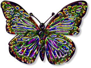
I’ve truly lost count of just how many logos I’ve designed or for how many businesses, associations and people; how many books and manuals I’ve illustrated over the years. I’ve done graphics, cartoons – there are still books in print in the US with my old cartoons in them! – and even whole ranges of illustrations like the 30 in “Enchanted World”, the 66 images from “For You A Star” or that whole series of German Symbols.
That’s just that, without the literally endless jacket and sleeve designs, inlays, the diagrams and all the web stuff I do, absolutely each and every day. On top of that, I paint for a hobby as well – but it really never occurred to me to notice that. It’s strange how things work out.
Q: What are some of your favourite designs?
Silvia: Oh, there are so many!
 Isca by the fire, 2002
One that springs to mind is the stained glass designs. Light and colour, right? Doesn’t get any better than stained glass, and I fully intend at some point to do something with that, some symbol paintings perhaps or something new.
One of my all time favourites is the Fire stained glass design.
That’s from In Serein, and that reminds me, I also like the cover for the First Edition of In Serein. Very retro and a bit unusual, but then most of my designs are like that, simply because I never went to design school and haven’t a clue how it’s supposed to be done properly. [laughs]
Q: Do you sometimes think that the fact you have not attended art college works in your favour?
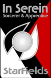 In Serein
Silvia: I don’t think we’ll ever know now! [laughs]
I am at a point now with the commercial design where I really don’t worry any more, and simply because I don’t know how many thousands, hundreds of thousands of instances of my designs are out and about and being practically used every single day by God knows alone how many people, that is a sign to me that whatever I’m doing, it seems to work and what more do you need?
What I try and do is to make something that transmits the message, the energy behind whatever this is that is being illustrated.
Q: Oceans of Energy – you can see that from 200 yards away, those colours!
Silvia: [laughs] “Oh my, aren’t we colourful!”
Look, I just love colours. I LOVE them. They can’t be bright enough for me!
Q: That whole series of covers – ET 1, 2, and 3, is really quite stunning.
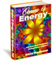 Silvia: The key to that design concept is that the images are fractals. If you look closely at the images, you will see that the edges are jagged – these are classic Mandelbrot fractal images. It is the colour and the fractal nature of it that I wanted for the Oceans of Energy theme – as above, so below, the Oceans of Energy are endless and you can zoom in and out to every level of existence.
Q: That concept works very well with the essence of EMO.
Silvia: Yes, very much so. And the new exhibition – 23 – is like that. It is in essence, a fractal experiment. It’s a combination of the oldest and the newest, or perhaps they are the same.
I can sit in front of an old desk, and see the lines in the wood, and they become a universe to me – and they can be anything at all.
Anything at all – depending on where you set your focal length.
It could be a map to an ancient world, it could be a piece of wood on the floor of a great cathedral, depending how you zoom it, and it could be anything at all.
I am completely fascinated by that.
23 is a combination of Art Solutions, and this original fractal movement.

Retrospective Part I | Part II | Part III | Part IV | Part V
Added Feb 26, 2004
| 9,880 Reads


